The Beginner's Guide to Choosing a Colour Palette for Your Home
Standing in front of a paint display with more shades of off-white than you thought possible is where most decorating plans stall. The worry is not really about colour. It is about committing to something you will see every single day. The reassuring part is that a cohesive scheme is rarely down to taste or luck. It comes from three practical things: undertones, the way light moves through your rooms, and a simple proportion rule that stops a space feeling either flat or chaotic.
Start With What Is Staying
Before you open a paint chart, walk the room and list everything you are not changing. Flooring, tiles, kitchen units, a fireplace, a sofa you still love. These fixed pieces already carry undertones, and they are the strongest clue you have.
Say you have warm oak floorboards and a grey sofa. The floor leans yellow-orange; the sofa probably leans blue. Rather than trying to find a wall colour that flatters both equally, let one lead. Pull the walls towards the warmth of the wood, then use cushions, a rug or a throw to bridge the cooler grey. If you are decorating more than one room, thread one colour through the connecting spaces. A hallway or staircase in a consistent neutral makes the whole house feel considered, even when the individual rooms differ.
Undertones, in Plain English
Every colour has a temperature. Whites lean cool, with blue or black pigment, or warm, with yellow, red or cream. Grey is almost never neutral: it might be blue-grey, green-grey, purple-grey or taupe, which is grey with a pink-brown base. These hidden leanings are what people mean by undertones.
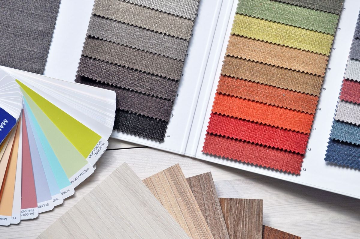
The easiest way to spot them is comparison. Lay your samples on a sheet of plain white paper and look at what each one does next to the white. One will turn yellow, another blue. Then compare them against each other, because a swatch judged on its own tells you very little. A neutral that looked perfect in the shop can read lilac the moment it sits beside a warm beige wall.
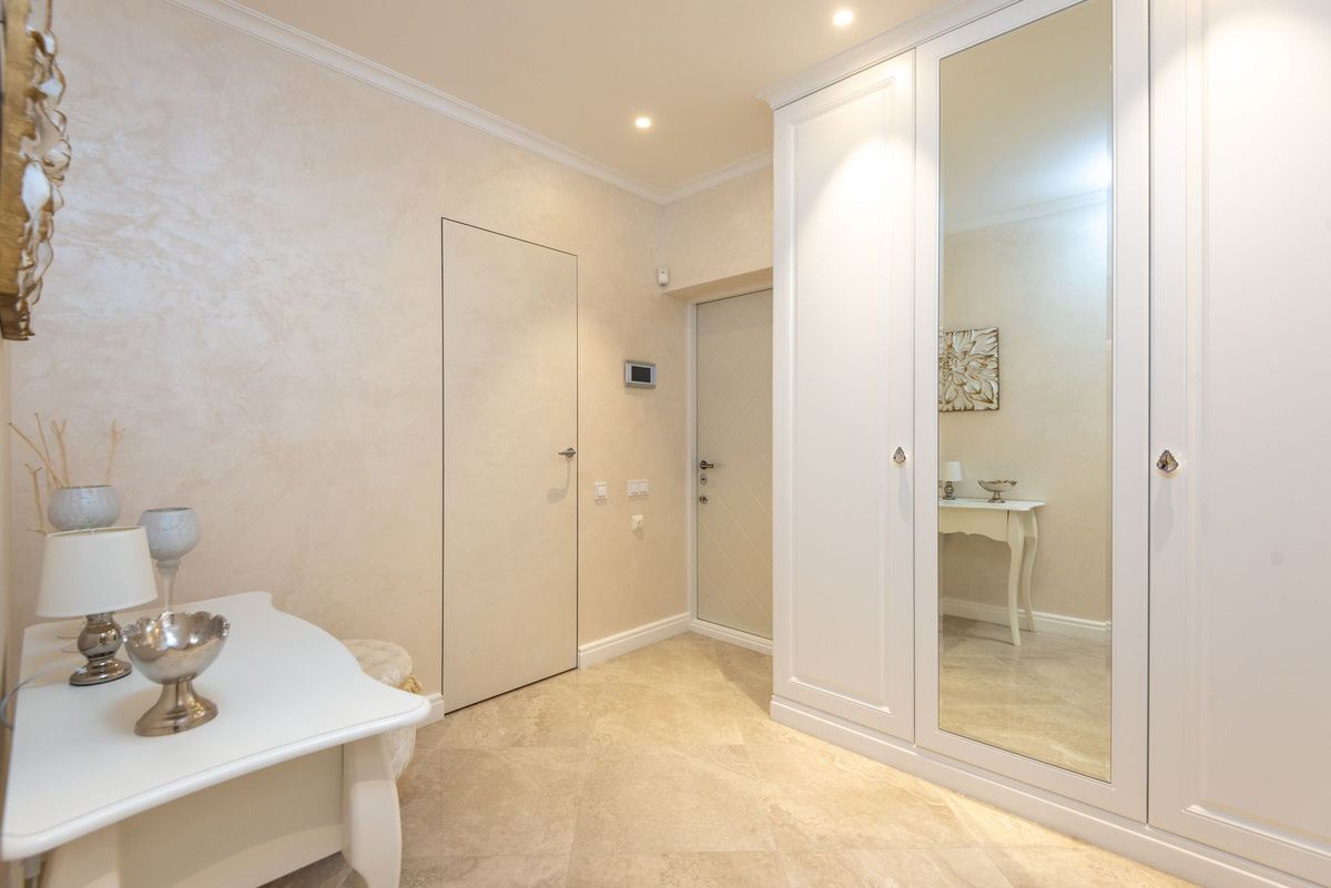
A useful rule for beginners: keep your neutrals in the same family. All warm, or all cool. Mixing a cool grey sofa with warm cream walls is the classic reason a room feels slightly off without anyone being able to name why.
Read the Light Before You Choose
Paint does not look the same in every room, because daylight is not neutral. In the UK, where many homes have windows only at the front and back, this matters more than most people expect.
North- and east-facing rooms
North-facing rooms receive cool, flat, blue-tinged light for most of the day. Pale greys and icy blues can turn dingy here. Warm neutrals, soft greens and deeper, richer colours hold their own. East-facing rooms get bright, cool light in the morning and dimmer light later, so a colour that looks lovely at eight o'clock can look tired by six.
South- and west-facing rooms
South-facing rooms get strong, warm light for much of the day. Warm colours can become intense, so cooler shades often balance the space beautifully. West-facing rooms are lit by golden afternoon and evening sun, which flatters warm colours but can leave the mornings feeling gloomy.
Whichever way your room faces, test properly. Paint two coats onto A4 or A3 sheets of lining paper rather than straight onto the wall, leaving a white border around the colour. Tape them up on two or three different walls, look at them in the morning, at midday and with the lights on in the evening, and live with them for a few days. Finish matters too: matt absorbs light and reads deeper, while eggshell and satin bounce a little back. In small or dark rooms, go a shade lighter than you think you want and keep ceilings and trim pale.
The 60-30-10 Rule, Made Simple
This is the proportion guide that keeps rooms from looking either washed out or busy. Think of your scheme as three parts.
- 60 per cent is your dominant colour: usually the walls, and often the flooring and your largest piece of furniture too.
- 30 per cent is your secondary: curtains, kitchen cabinetry, a second sofa, a rug or a large piece of joinery.
- 10 per cent is the accent: cushions, throws, lamp bases, artwork, hardware and any small hit of a stronger colour.
A worked example. Sixty per cent warm off-white walls with oak floors. Thirty per cent muted sage on the kitchen units or the curtains. Ten per cent terracotta cushions and a brass lamp. The accent can be bolder than you would dare to paint a whole wall, precisely because there is so little of it.
Treat the numbers as proportions, not laws. If a room feels restless, it is usually the 30 and the 10 competing rather than supporting each other. Repeat your accent in at least three places so it reads as a decision rather than an accident.
Building Your Palette in Four Steps
- Choose the dominant neutral based on what is staying in the room.
- Pick a secondary that shares the same undertone, then shift its depth. A tone two or three shades darker or lighter than the walls gives contrast without a clash.
- Add one accent. Keep it to a single colour family and use it in small, repeatable doses.
- Write everything down, including product names, codes and finishes, and keep the note somewhere you will find it when you need to touch up a scuff.
Mistakes That Make a Scheme Feel Wrong
- Testing a colour in one corner of one room and assuming it will behave the same everywhere.
- Choosing from a screen. Displays shift colour, and the photo was taken in someone else's light.
- Forgetting ceilings and trim. A tinted ceiling or a trim colour with a mismatched undertone can undo good wall choices.
- Using every colour you like in one room. Three colours plus a white is plenty for most spaces.
- Choosing bulbs last. Warm white bulbs and cool white bulbs change how a wall colour reads, so decide on your lighting before you commit.
Let the Room Come Together Slowly
Buy paint last where you can. Gather fabric swatches, rug samples and one or two test pots first, then live with the shortlist for a week before you spend money on litres. Rooms that look effortless are usually the ones that were finished over months rather than a weekend, with each choice made against something already in the space. Take your time, keep your palette to three colours plus a white, and you will end up with a scheme that still feels right long after the novelty of a trend has worn off.
Photo: Andre Moura / Pexels
You Might Also Like
Carpet, laminate, vinyl and engineered wood compared on durability, cost and maintenance — with practical advice on which flooring works best in each room of a busy family home.
A practical beginner's guide to transforming second-hand furniture: how to choose a solid piece, prep it properly, paint in thin coats, and seal it for a durable finish.